Wednesday, 17 December 2014
Tuesday, 16 December 2014
Conclusion For Feature Page
CONLUSION
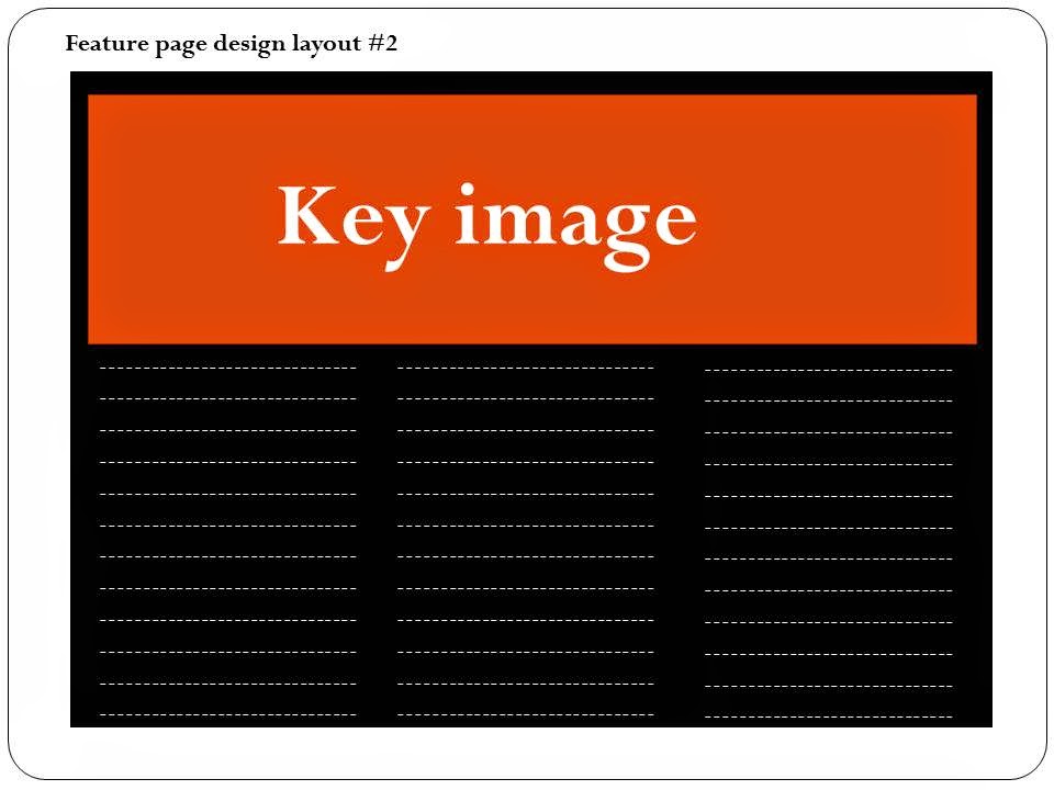
After planning and sketchng out the pages for my magazine i have concluded that the layout of my feature page is going to be spread across a double page. This is so that it is convienient for the readers as every information they will need to acess about the artsit will be on one page and they would not have to flick through pages to acess this information. Also it will be split up into subtitle so that everything is well organised and the readrs will instantly know where to look to attain a certain piece of informatrion about the artist. The feature page is also going to include a couple og images of the artist these images are going to be large so that they stand out and attract the attention of the audience. Ther are going to be engaing poses so that the target audience can feel more connected to the artist when they are viewing it and allows them to feel as though they are on the same level as the artist and they are apart of the story that is being shared with them.
Conclusion For Plan & Sketch Of Magazine Contents Page
CONCLUSION
After planning and sketching the potential contents page for my music magazine, i have decided that i am going to include in this page a key image of the same artist that is on the front cover of the magazine, alongside images of other artists that are to feature in the magazine. This is so that the readers know what to expect and look forward to when reading my magazine. The word 'contents' is going to be printed largely across the top of the page so that the audience are able to identify quickly what the page is about. It is also going to be done in the same font as the name of the magazine, this is so that the theme of the magazine layout is kept the same through out the pages. In addition to that features such as; the date, web link, things that are going to feature in the magazine and images are going to be included in the magazine. This holds the variety of information that will be added to my magazine. The elements of my contents page are going to overlap in most cases in a way where a piece of text will be brought forward to a picture so that it can be read easily. This means that all the information on this page is not squahed and it is not too overwhelming to the raeders as the informatuion is going to be clear and easy to understand. This makes it user friendly and makes it user friendly.
Friday, 12 December 2014
Friday, 5 December 2014
Conclusion From Plan & Sketch Of Front Magazine Cover
Wednesday, 26 November 2014
Wednesday, 19 November 2014
Friday, 14 November 2014
Wednesday, 12 November 2014
Possible Titles
Those are possible titles for my
music magazines. I have chosen those titles as I feel like they either relate
to the term Hip-Hop and RnB or are very catchy names for the genre of music
magazine that I am going for. This is so they stand out to the public and are
able to draw in the attention of the target audience as they can easily relate
the content of the magazine to the title. Also it relates to how strong and powerful the magazine is in connection to the type of music it portrays.
Friday, 7 November 2014
Font Style
The font style that has been highlighted are the ones
that I consider using for the font of my magazine. This is because I believe
that the style suits the genre of my magazine, which is hip-hop/ RnB. Also they are font that really
stand out which is very good to use to captivate my audience’s attention. This would make my magazine more noticeable
and dissimilar from others as most music magazine tend to use very similar
font. The fonts chosen also fit the style of various fonts used on music magazines, this is so that the intentions of the magazine is noted at the start and people can recognise it as a music magazine.
Wednesday, 5 November 2014
Friday, 24 October 2014
Pie Chart Results From Questionnaire
The conclusion made from the data I have
collected is that for my magazine I know it is important to carefully plan the
way the image of the artist is set up on the front cover. For example if they
are at an high angle shot, the viewers may feel like they are looking up at
them. This is to create the feeling of superiority for the artist and can
symbolise how the artist may be adored and looked up to by their fans. However
if it was to be an eye level shot then the audience would feel like they are
more connected to the artist in a personal level and make them feel like they
can relate to them on a down to earth basis. Also from the data I have
collected I have decided that I'm going to make my magazine an affordable price
for my target population. This is so they can feel like they can always keep up
with the latest in the music industry without money being an issue.
Friday, 17 October 2014
Wednesday, 15 October 2014
Friday, 10 October 2014
Wednesday, 8 October 2014
Wednesday, 1 October 2014
Wednesday, 24 September 2014
College Magazine Reasearch
I noticed that all these images have similarites. For example the masthead at the top is very large and are often colourful. This is possibly to attract attentionof the audience when they see it. They all also feature a midshot of their model looking happy. This is to reinforce the possible feeling of happiness into the students reading it.
However, they all different shot angle as some of them the model is looking directly into the camera while others it is from a low angle looking up.
Subscribe to:
Comments (Atom)


