Wednesday, 17 December 2014
Tuesday, 16 December 2014
Conclusion For Feature Page
CONLUSION
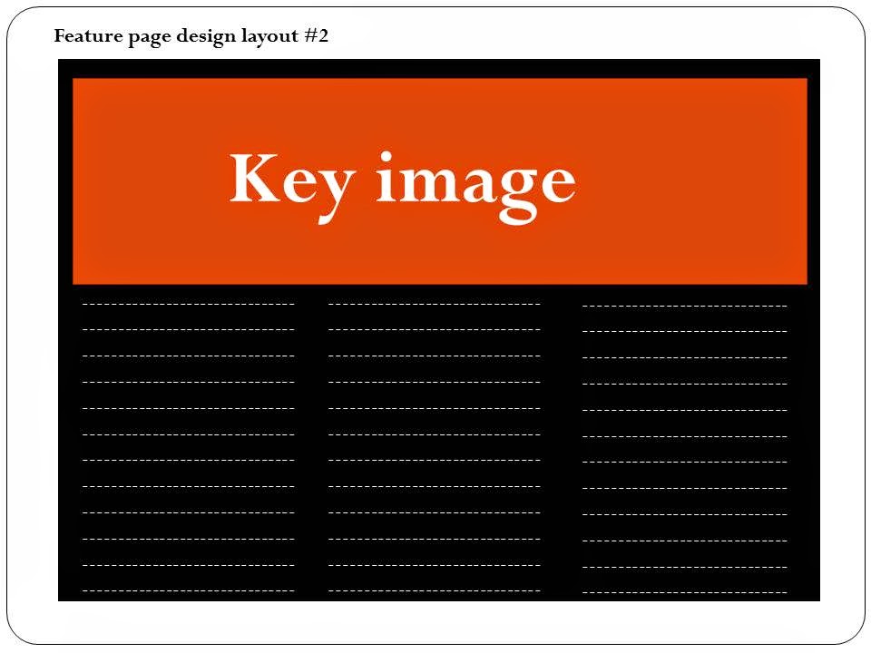
After planning and sketchng out the pages for my magazine i have concluded that the layout of my feature page is going to be spread across a double page. This is so that it is convienient for the readers as every information they will need to acess about the artsit will be on one page and they would not have to flick through pages to acess this information. Also it will be split up into subtitle so that everything is well organised and the readrs will instantly know where to look to attain a certain piece of informatrion about the artist. The feature page is also going to include a couple og images of the artist these images are going to be large so that they stand out and attract the attention of the audience. Ther are going to be engaing poses so that the target audience can feel more connected to the artist when they are viewing it and allows them to feel as though they are on the same level as the artist and they are apart of the story that is being shared with them.
Conclusion For Plan & Sketch Of Magazine Contents Page
CONCLUSION
After planning and sketching the potential contents page for my music magazine, i have decided that i am going to include in this page a key image of the same artist that is on the front cover of the magazine, alongside images of other artists that are to feature in the magazine. This is so that the readers know what to expect and look forward to when reading my magazine. The word 'contents' is going to be printed largely across the top of the page so that the audience are able to identify quickly what the page is about. It is also going to be done in the same font as the name of the magazine, this is so that the theme of the magazine layout is kept the same through out the pages. In addition to that features such as; the date, web link, things that are going to feature in the magazine and images are going to be included in the magazine. This holds the variety of information that will be added to my magazine. The elements of my contents page are going to overlap in most cases in a way where a piece of text will be brought forward to a picture so that it can be read easily. This means that all the information on this page is not squahed and it is not too overwhelming to the raeders as the informatuion is going to be clear and easy to understand. This makes it user friendly and makes it user friendly.
Friday, 12 December 2014
Friday, 5 December 2014
Conclusion From Plan & Sketch Of Front Magazine Cover
Subscribe to:
Comments (Atom)


