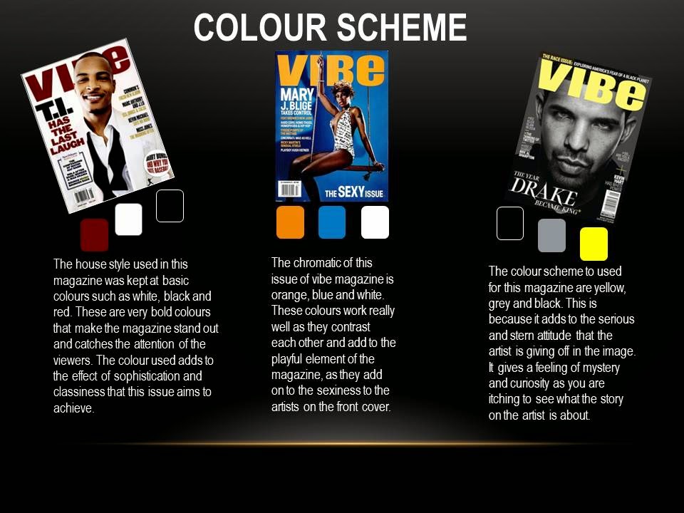
From this form of research I have decided to make the house colours of my magazine; black, white and grey. This is becuase I believe it is very sophisticated and won't take much attention away from my key image. The chromatics of those colours are also very soft and would keep my magazine looking composed like other music magazines.
Saturday, 28 February 2015
Further Colour Scheme Research For Magazine
I decided to ask some of my target audience on their opinion on what colours scehme will be good for a music magazine cover. I chose to do this on social media via Twitter. This is beacuse millions of people use it on a daily basis and it is a very easy form of contact with my target audience. This was so I could get inspiration from people who could potentially be interested in buying the magazine as they are whom it is targeted at. This is also a way of being consumer friendly and getting in the opinion of the public before making the product.
Friday, 27 February 2015
Chosen Title and font
I have decided that the chosen title for my magazine cover is going to be URBAN magazine. This is because I feel like it is a name that my audience can relate to as it shows the type of personalities it is targeted at. The name represents the genre of music that the magazine is aimed at which is what was intended. This is so that when people see the name URBAN they instantly relate it to rap/hip-hop and RnB music.
 The font I have chosen also is in a style that can be related to the genre my magazine is aimed at. This is beacsue it is in a style that is very 'urban' and youthful. It is a very friendly font that will appeal to the target audinece that it is aimed at as it is friendly to younger generations. Also the R in this style allows it to be very distinctive in comparsion with other magazines and gives it an element that makes it stand out.
 The font I have chosen also is in a style that can be related to the genre my magazine is aimed at. This is beacsue it is in a style that is very 'urban' and youthful. It is a very friendly font that will appeal to the target audinece that it is aimed at as it is friendly to younger generations. Also the R in this style allows it to be very distinctive in comparsion with other magazines and gives it an element that makes it stand out.
Monday, 23 February 2015
Subscribe to:
Posts (Atom)


